Brückner & Brückner gestalten Marken im analogen und digitalen Raum. Sie vereinen jahrelange Erfahrung in Deutschlands führenden Markenagenturen. Dort haben sie unter anderem für Ärzte ohne Grenzen, Audi, BMW und Siemens, sowie zahlreiche kleinere Kunden aus dem kulturellen und sozialen Bereich gearbeitet.
Kontaktperson
Johannes Brückner
Philip Brückner
Kontakt
Mathiesstraße 16
44147 Dortmund
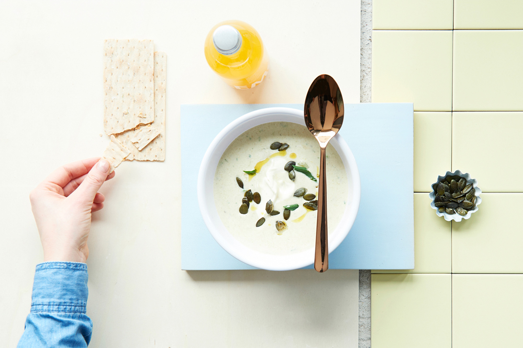
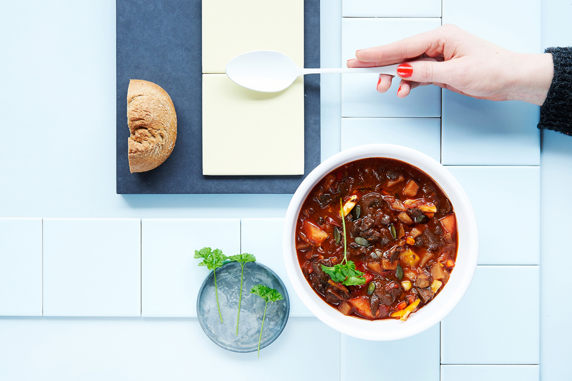
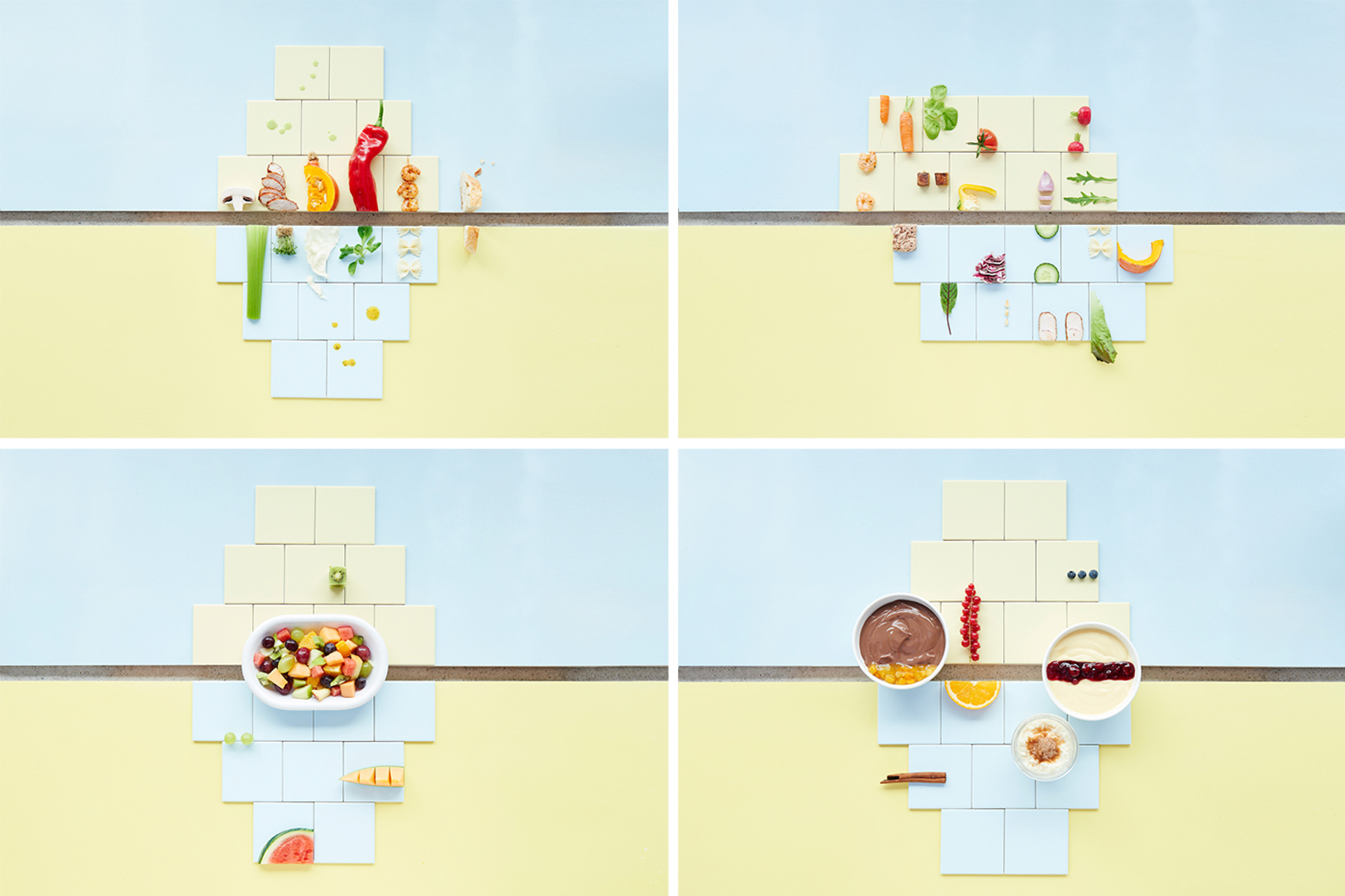
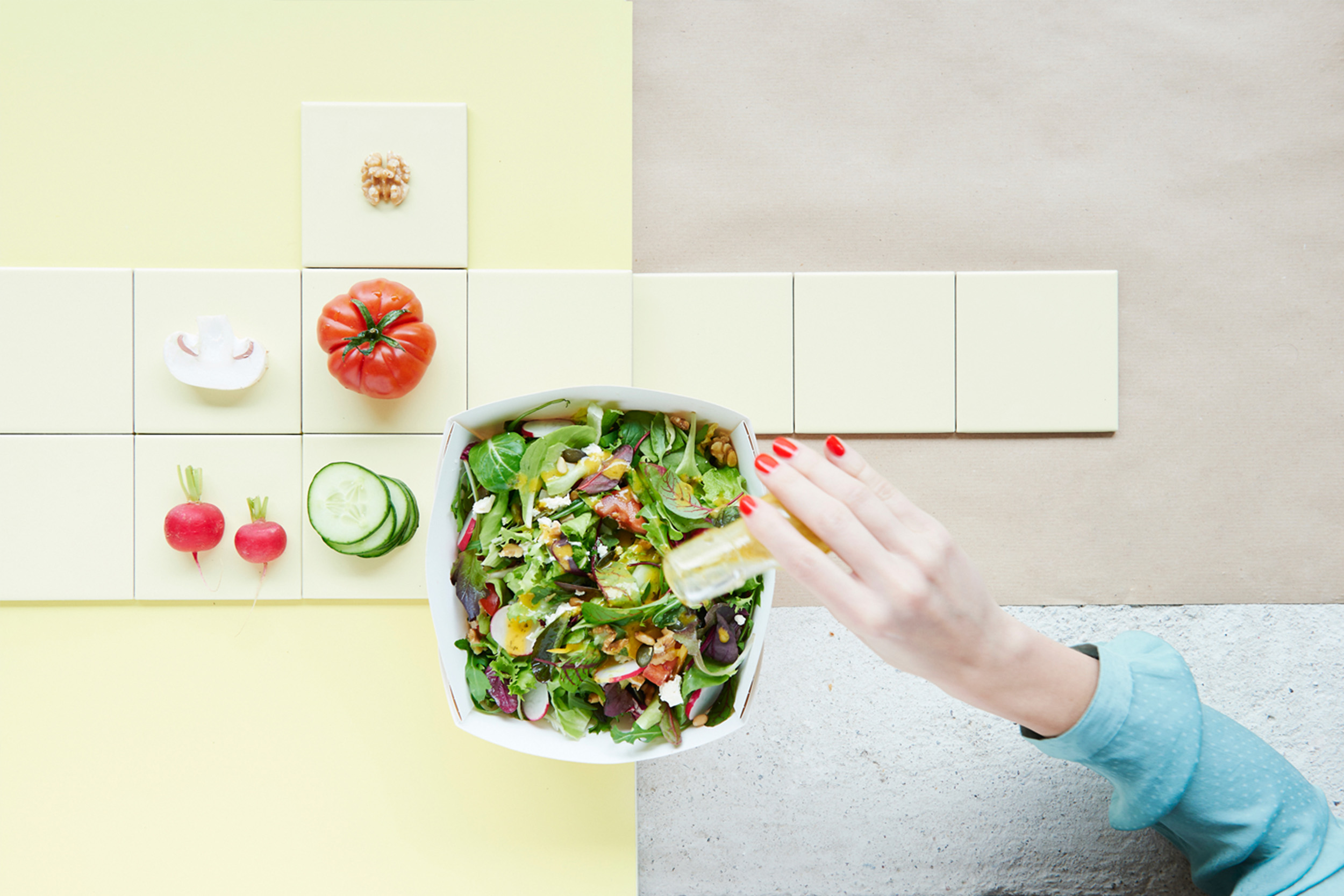
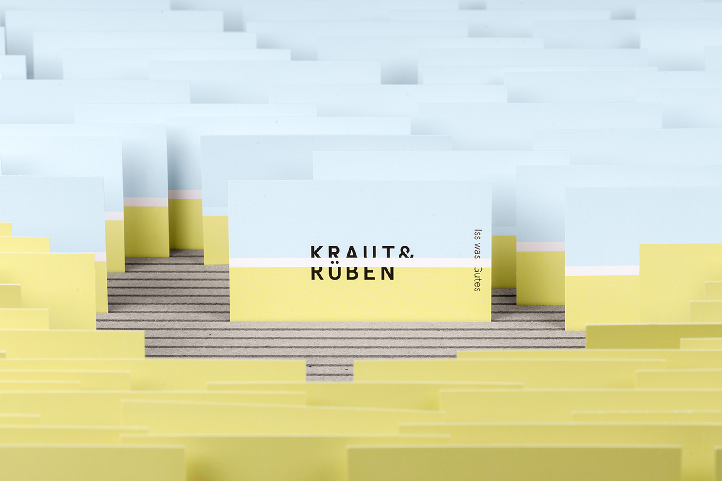
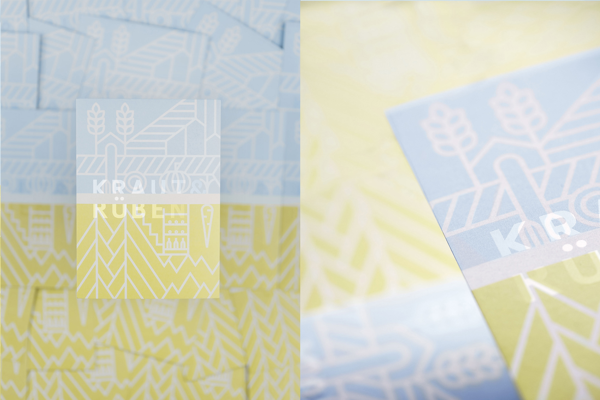
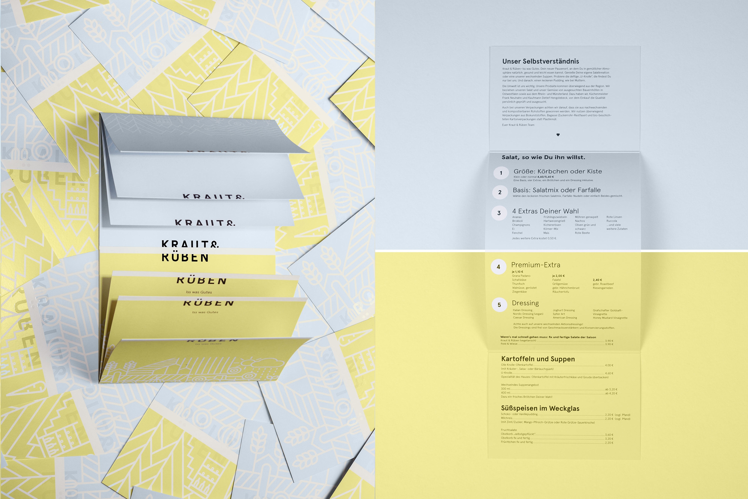
Kraut & Rüben Corporate Design
Unplastered brick walls, bare light bulbs and an old barn door: Kraut & Rüben combines farm with industrial charm. The focus of the food on offer: salad. For the basis of the salad mix, which can be enriched with farfalle pasta at will, four ingredients can be selected. Olives, chick peas, red lentils or strawberries? Kraut & Rüben focuses on variety and seasonal supply. This also applies for the soups, materialising, depending on the season, as light vegetable soups or hearty stews, as well as for the different variations of oven potatoes. Always on the menu: homemade vanilla or chocolate pudding and rice pudding. Design The design concept is based on a simple principle: cabbage (Kraut) grows upwards and turnips (Rüben) grow downwards. Using no green color, we tried to create a simple yet concise design without using the typical clichés. The up- and downwards principle was applied to the logo, stationery, photography and interior design. Colophon’s Apercu font was the perfect fit for Kraut & Rüben. For the logo it was slightly cut to emphasize the concept. As the client took us on board at a very early stage, we had the possibility to create a concept that really extends to all dimensions.

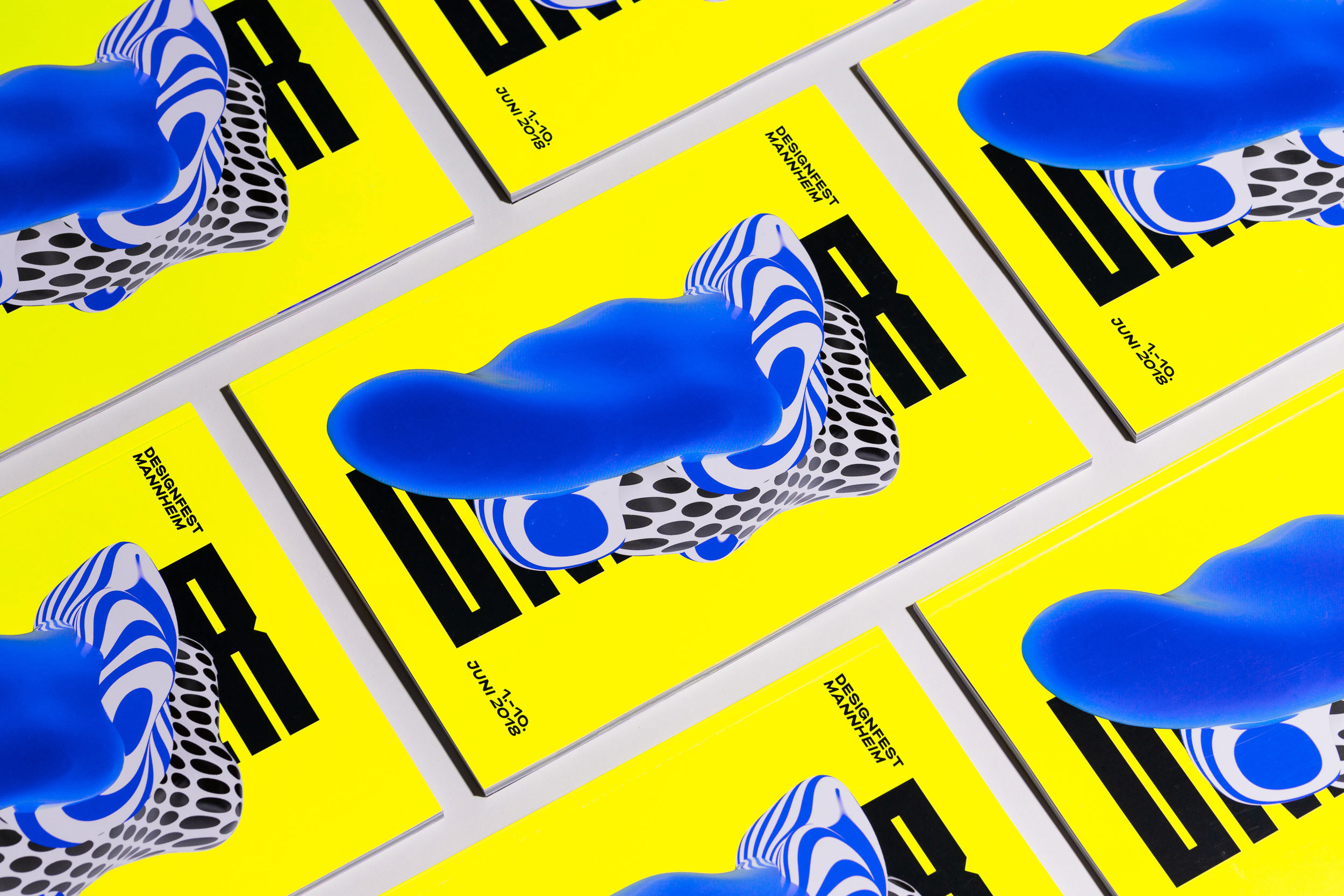
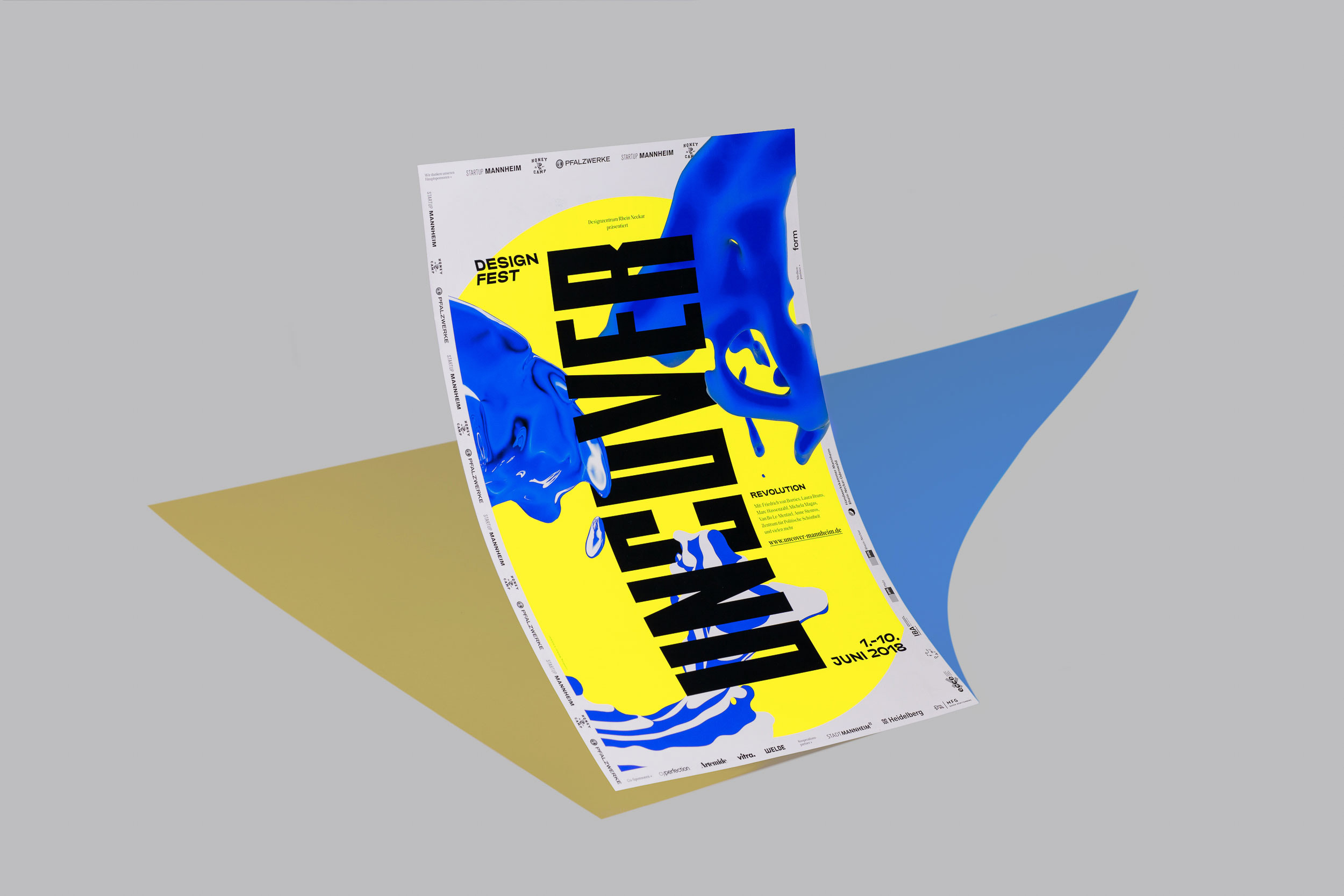
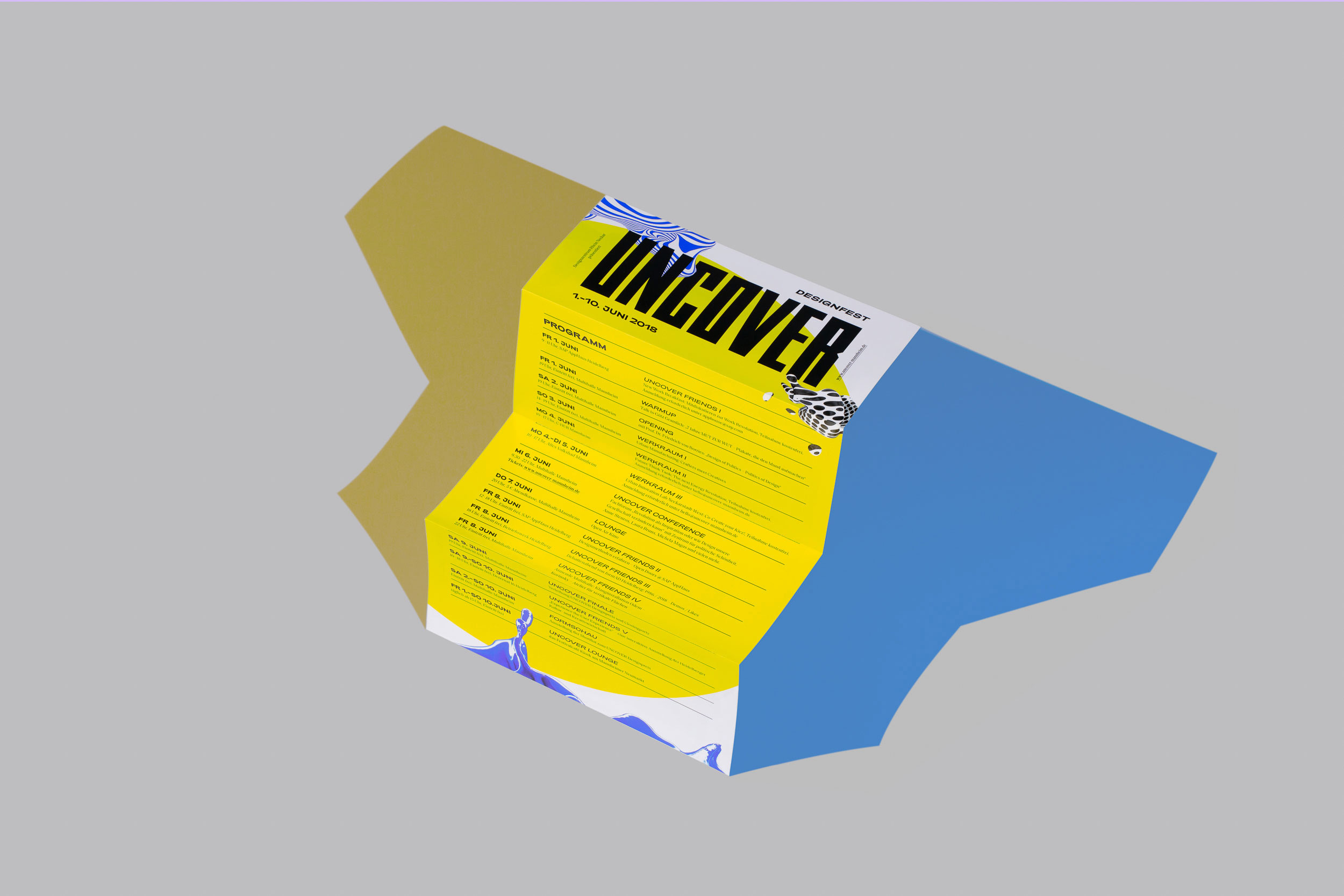
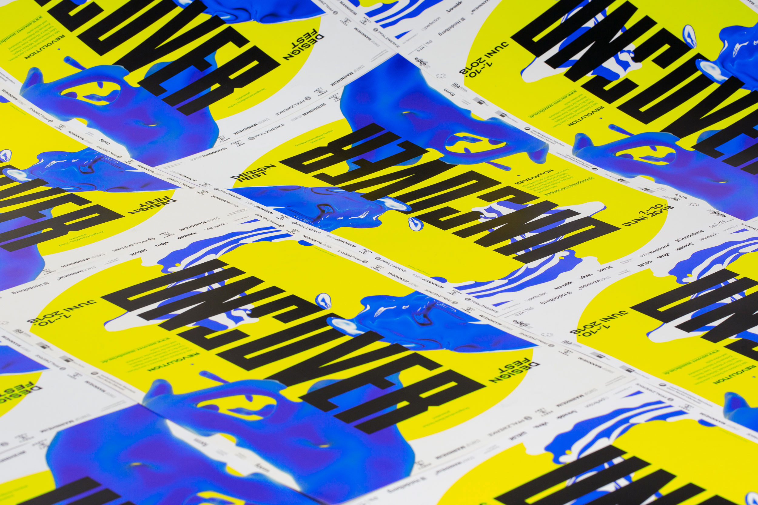
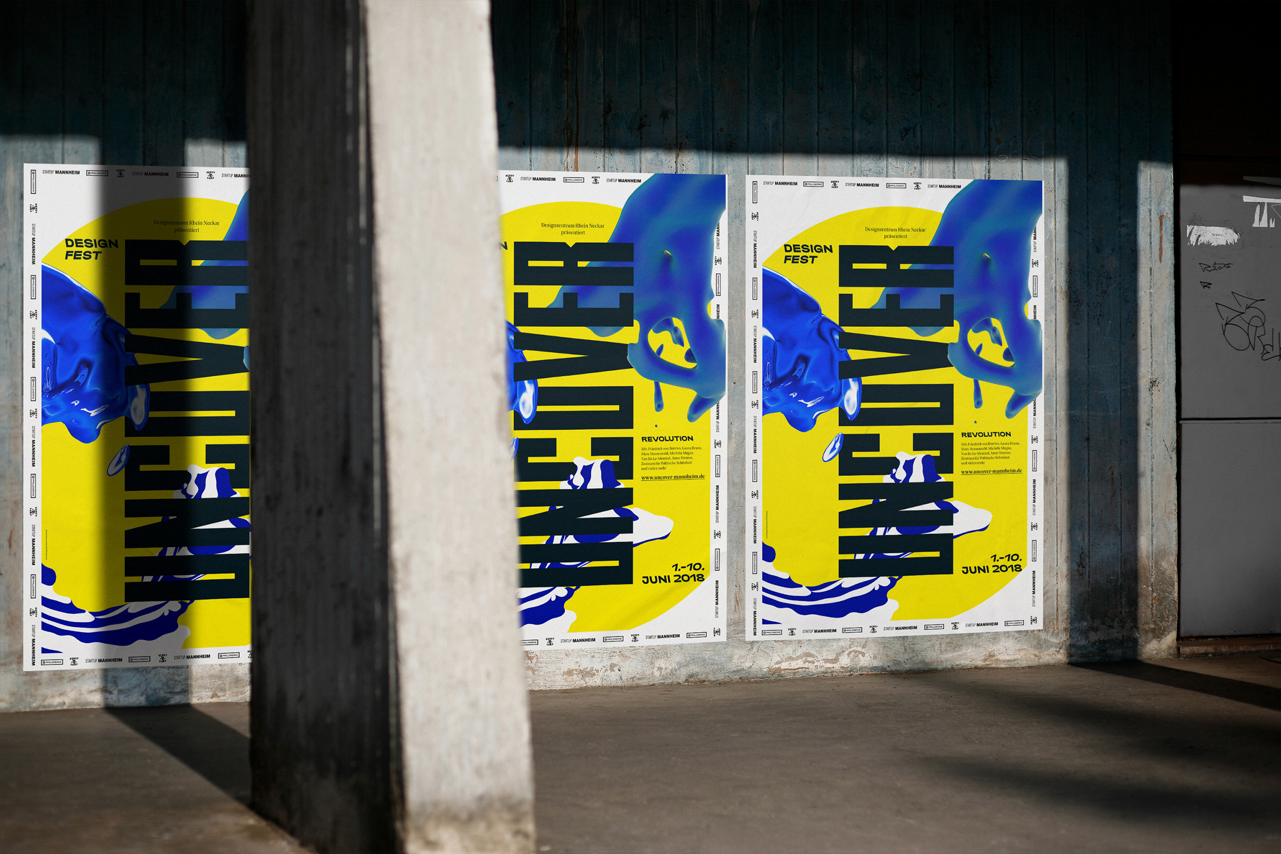
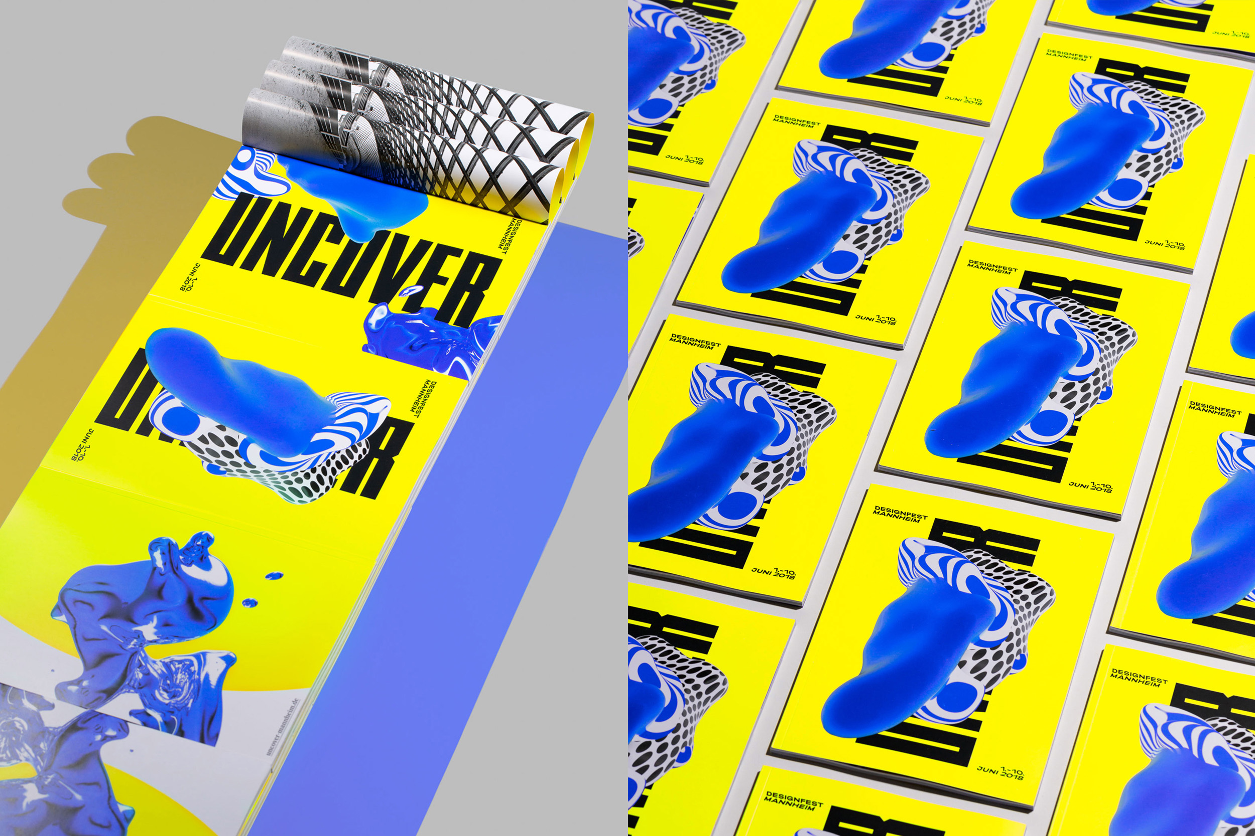
Uncover Design Fest
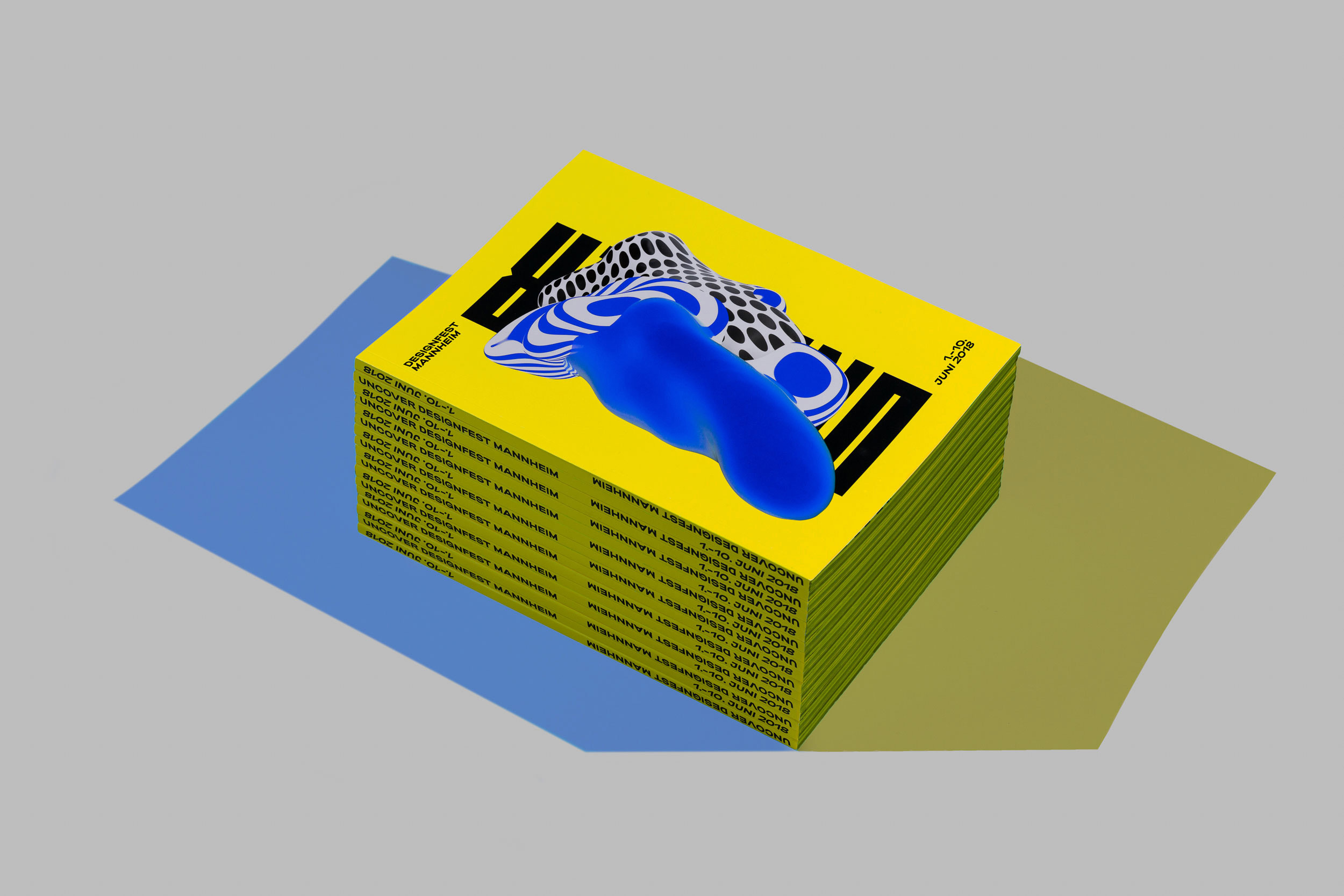
The UNCOVER Design Festival has been held in Mannheim since 2016. It sees itself as a platform for cooperation and exchange for designers, companies / organisations interested in design and design consumers – in and beyond the region. Speakers such as Cesy Leonard (Centre for Political Beauty), Van Bo Le-Mentzel or Stefan Sagmeister are the ones who inspire thousands of visitors to the festival every two years. In 2018 we were responsible for the visual appearance of the festival. Together with an interdisciplinary team, we created a flexible design that changes depending on the application. The festival took place in a breathtaking location: the Mannheimer Multihalle. The architect Carlfried Mutschler designed the hall, the Pritzker prizewinner Frei Otto completed it with a revolutionary lightweight flat supporting structure – to this day the largest freely formed wooden grid shell construction in the world.
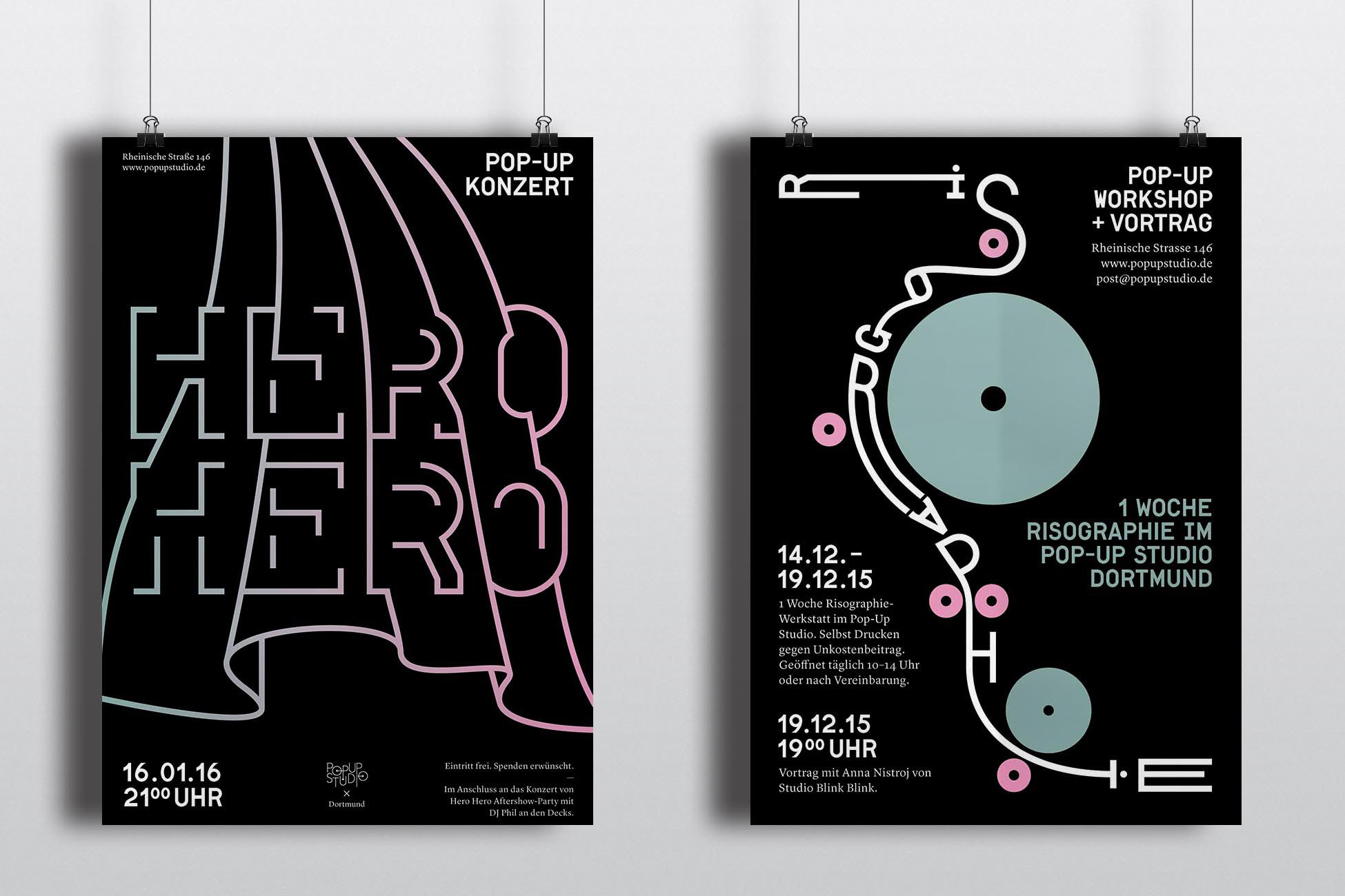
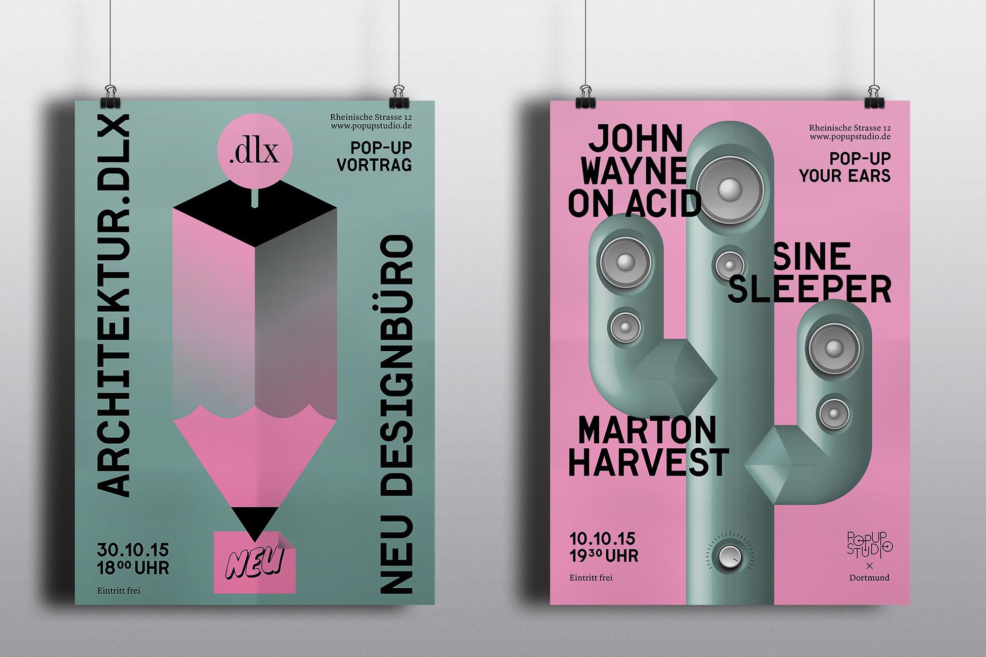
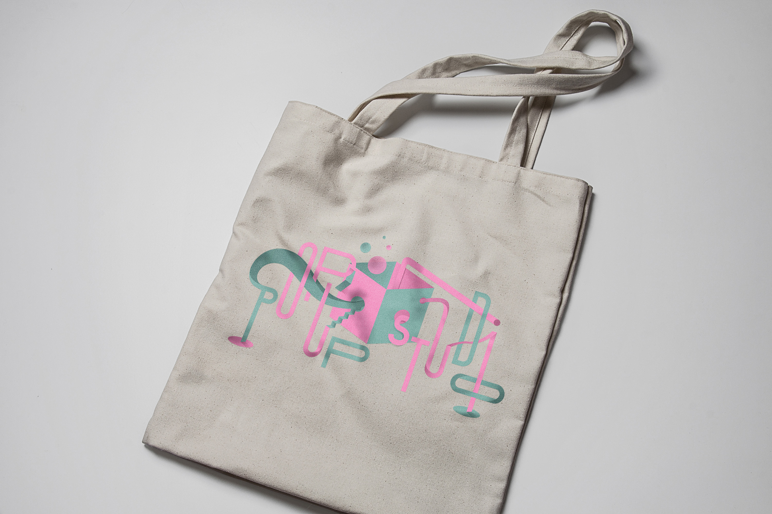
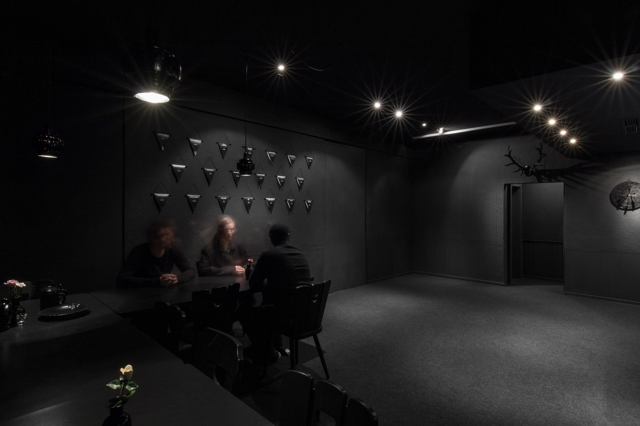
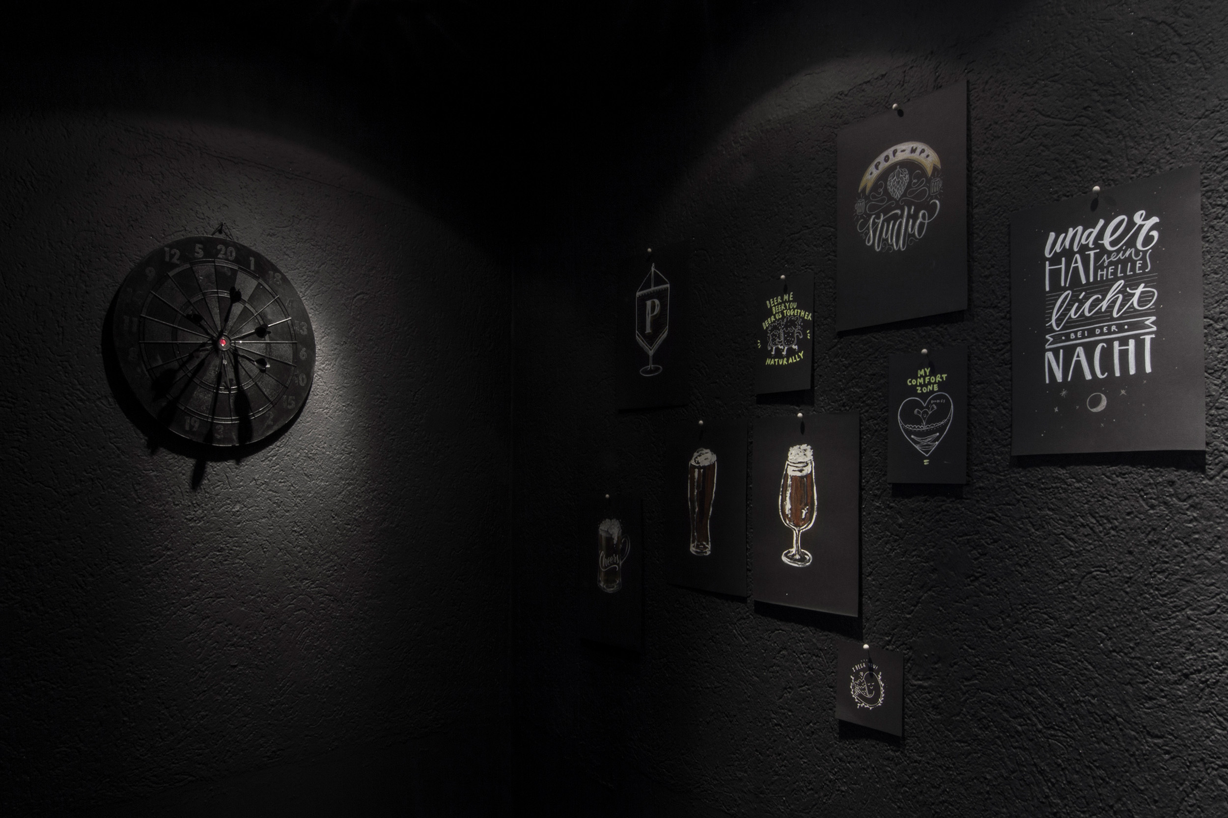
Pop Up Studio
With the Pop-Up Studio we transform vacancies into a temporary work & project space for creative people from various disciplines. The networking of people from different cultural and creative industries creates new synergies. During the first three months, the Pop-Up Studio was already a concert stage and lecture room, but also a gallery, reading stage, showroom and catwalk. The withdrawal of industry from Dortmund is at the same time a great opportunity for the city to redesign vacant spaces. Lectures by: Markus Mielek, Stückwerk, KoeperHerfurth, Please don’t touch, Van Bo Le, Menzel, Deutsche & Japaner, NEU Designbüro, Architektur DLX, Prinzträger, AdLips, Marc Suski, JAC Gestaltung, Labor B, Stefan Schwabe, Bastian Allgeier (Kirby), Marc Thiele (Beyond Tellerrand). Concerts by: KUF (Berlin), HeroHero (Köln), Sine Sleeper (Düsseldorf), Der weise Panda (Berlin), John Wayne on Acid (Düsseldorf). Miscellaneous: Illustratorenstammtisch, Infographics exhibition, Riso print workshop, Dinner together with refugees from four countries.
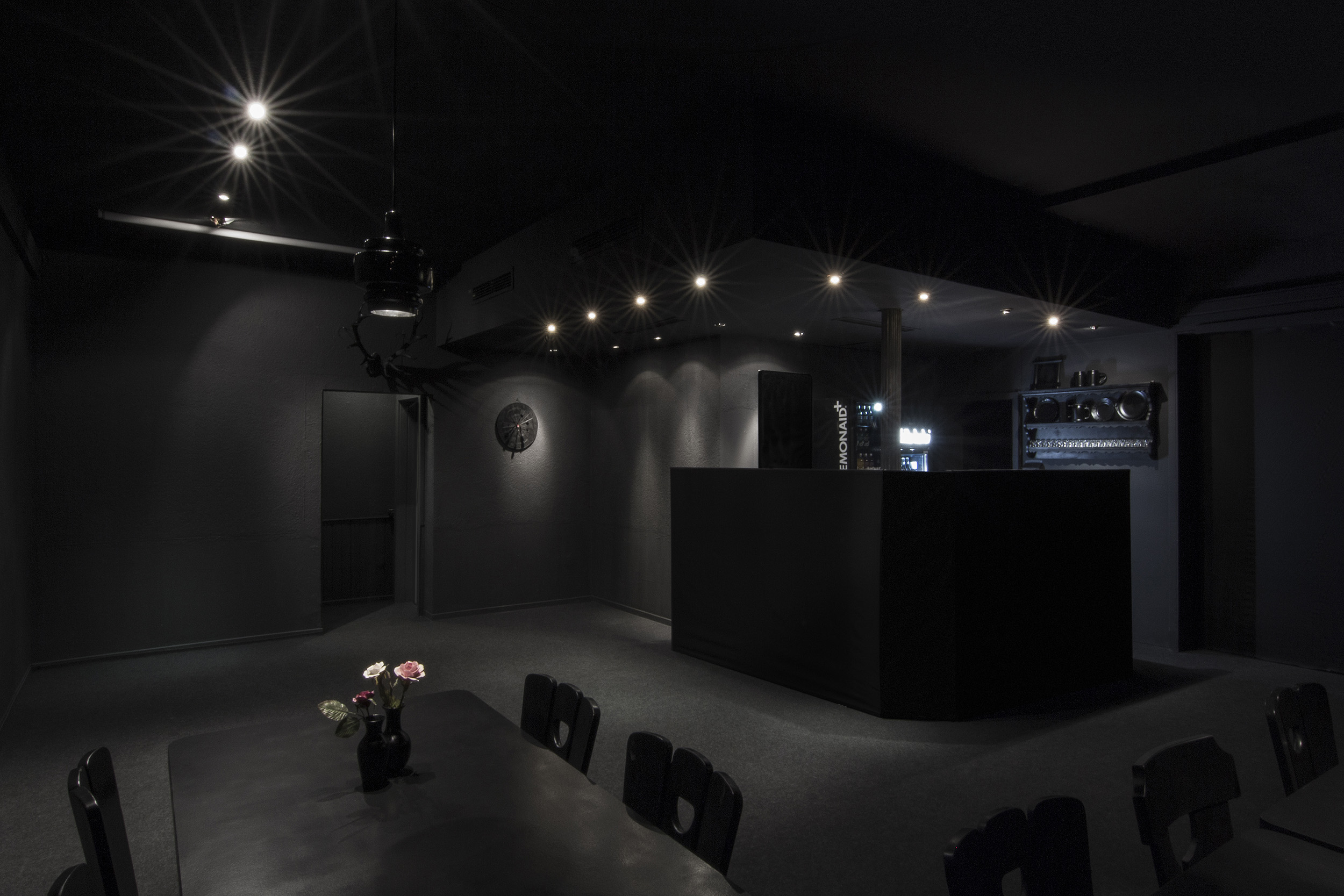
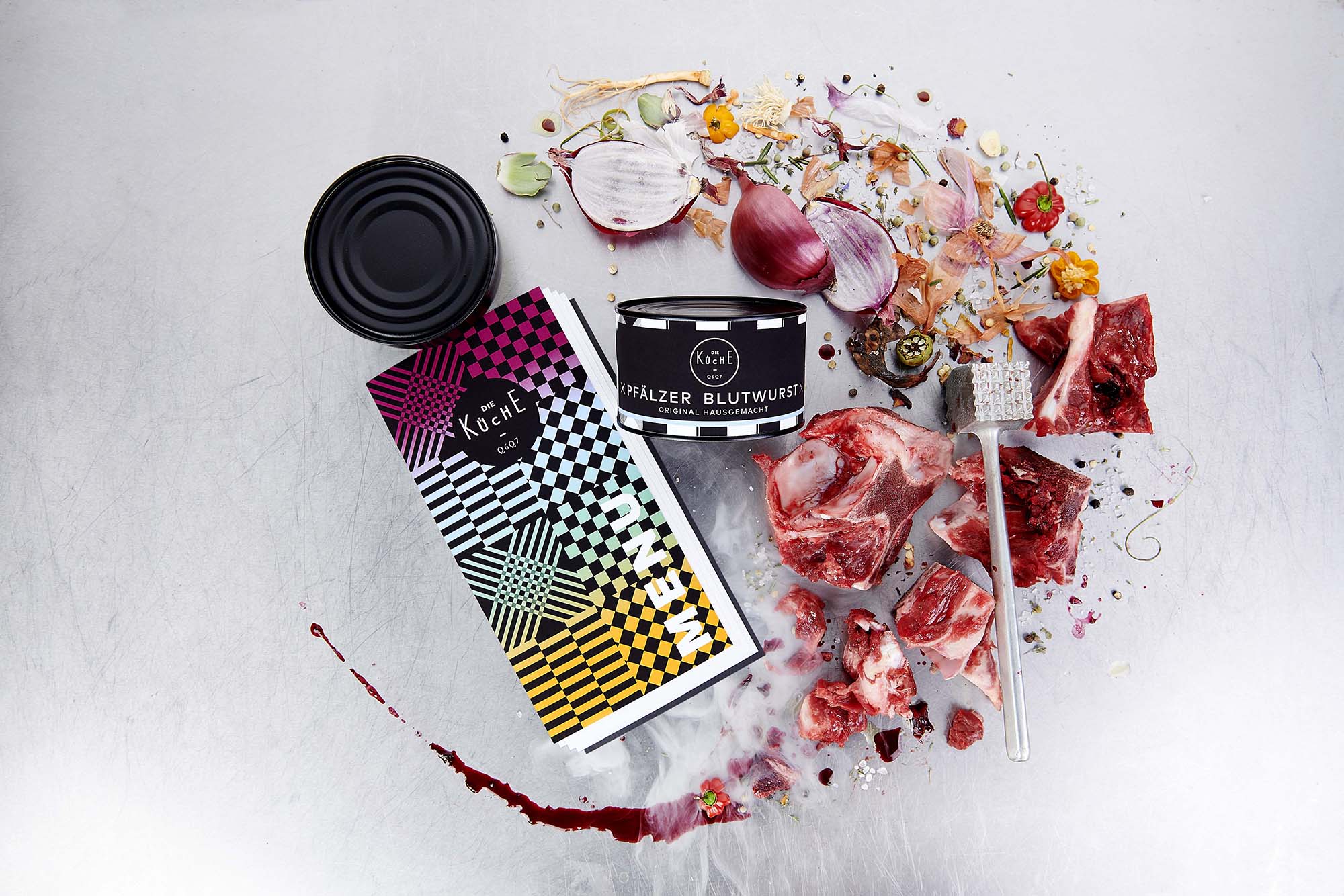
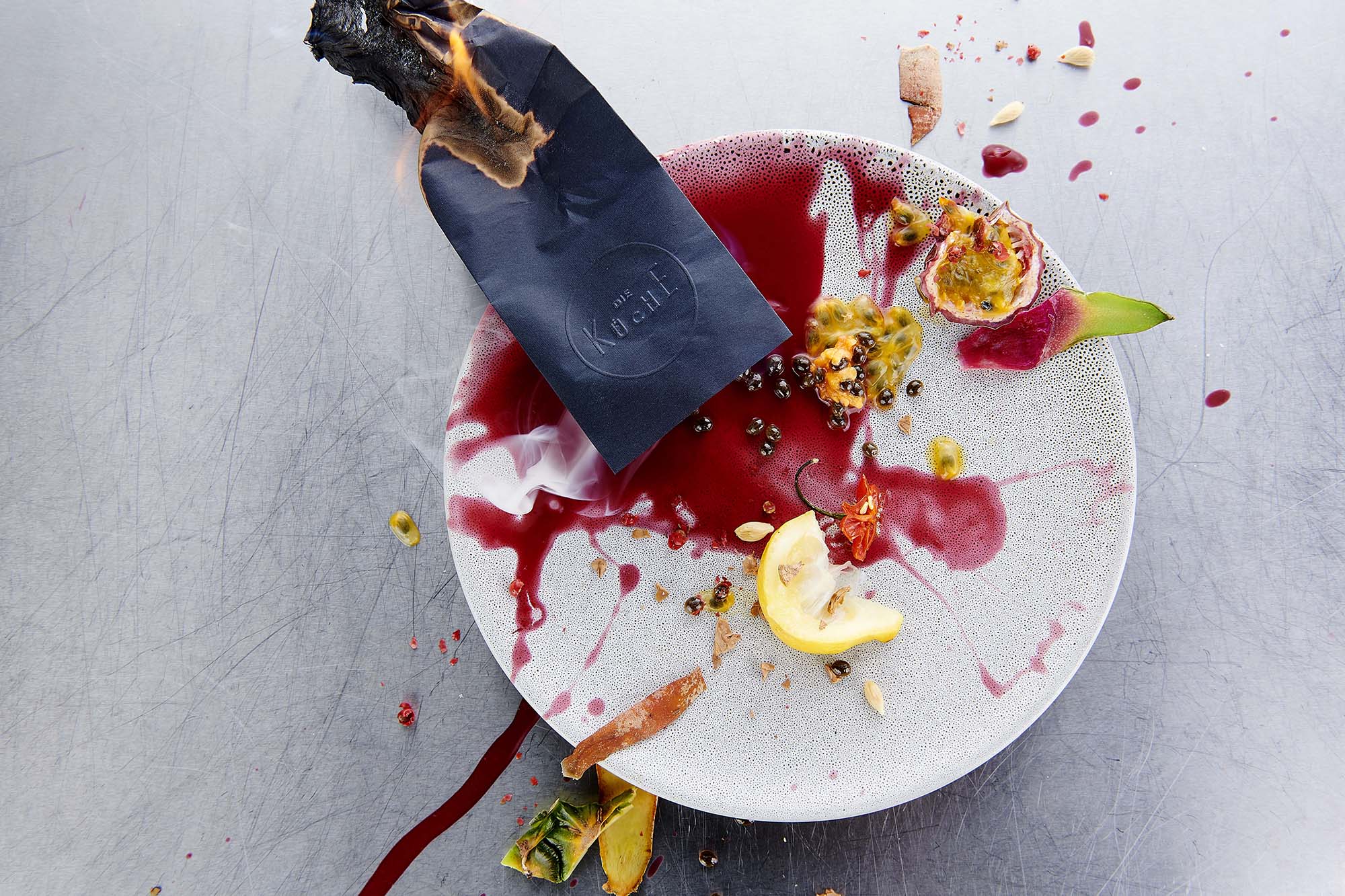
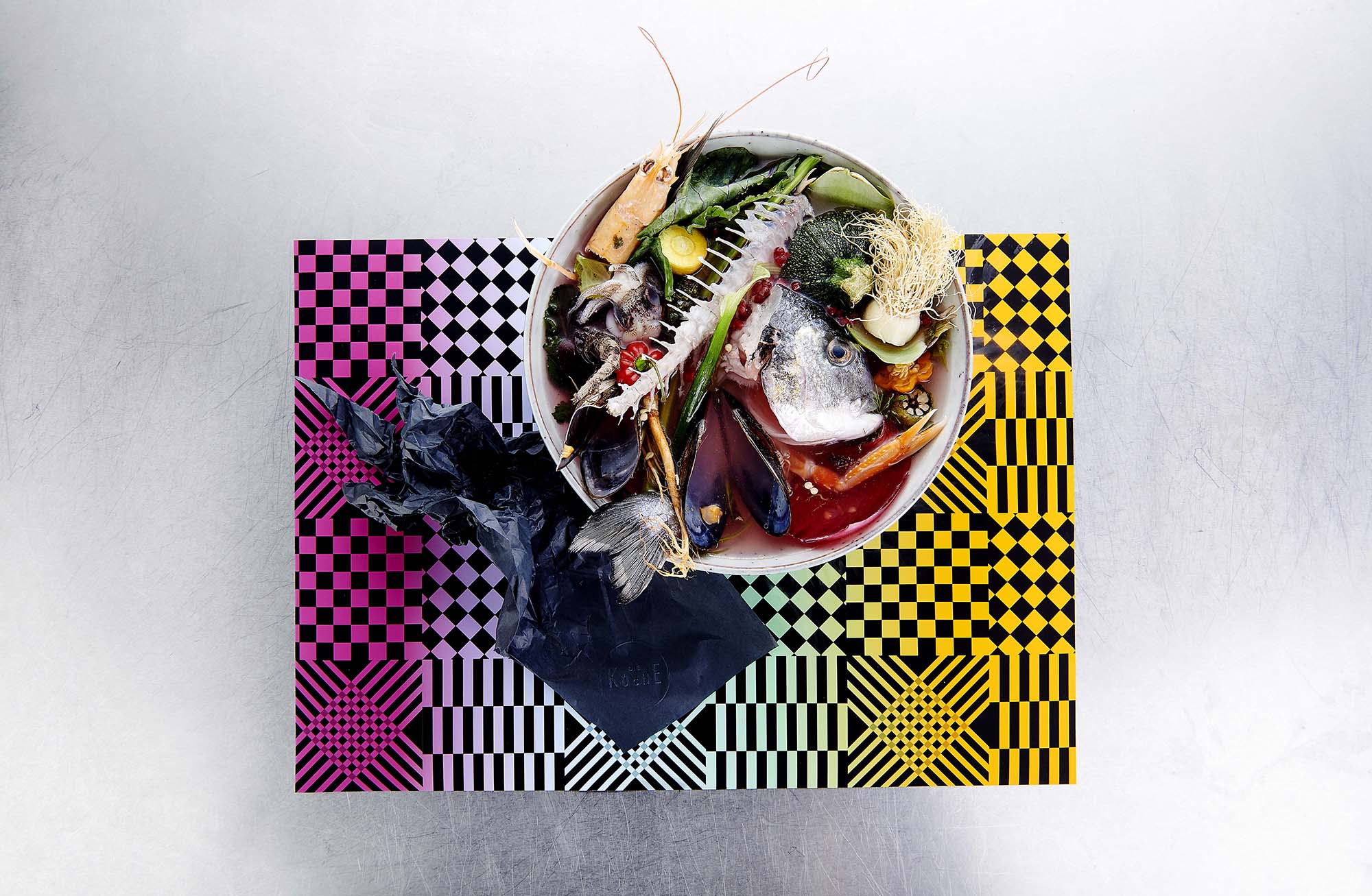
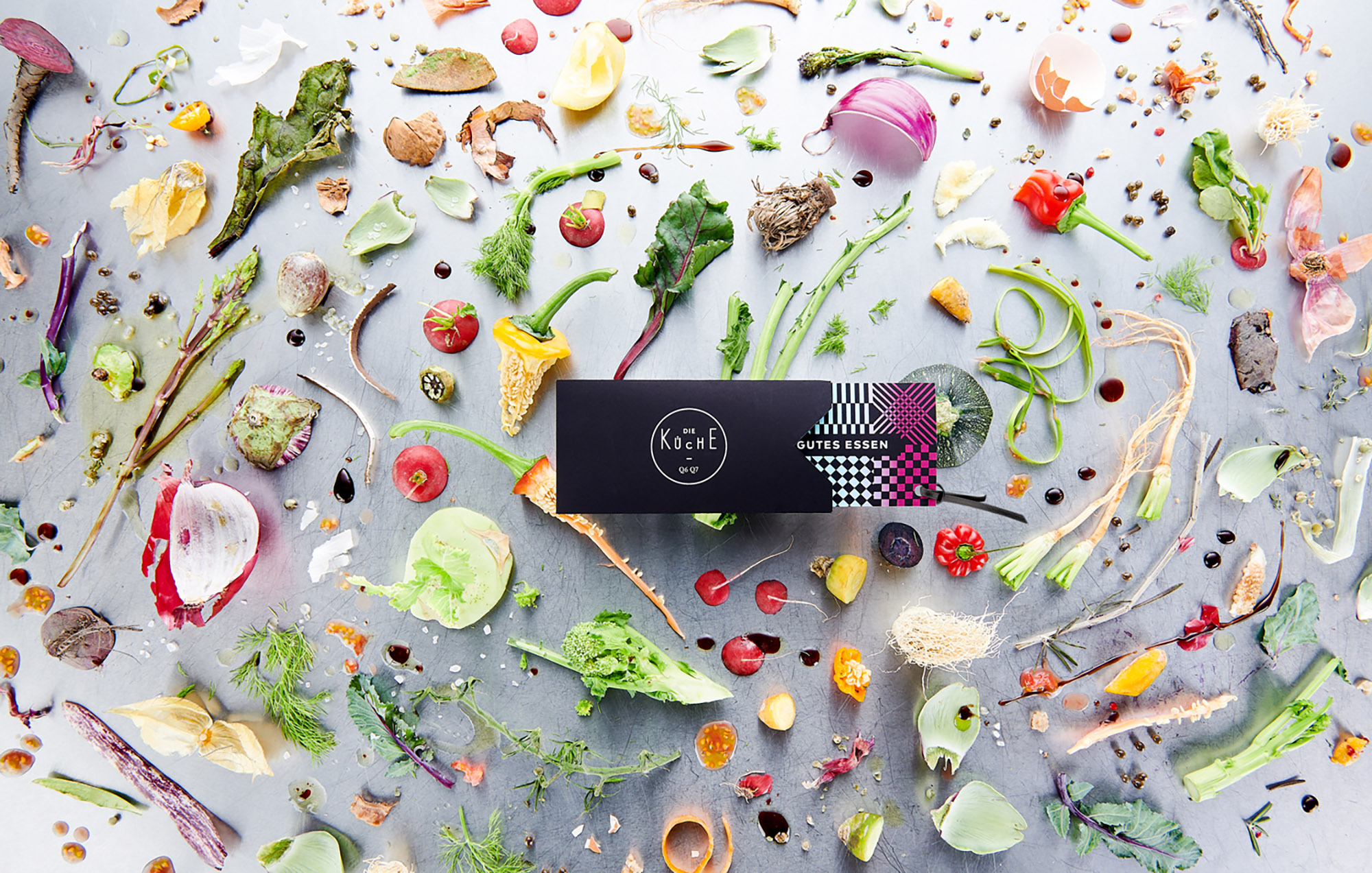
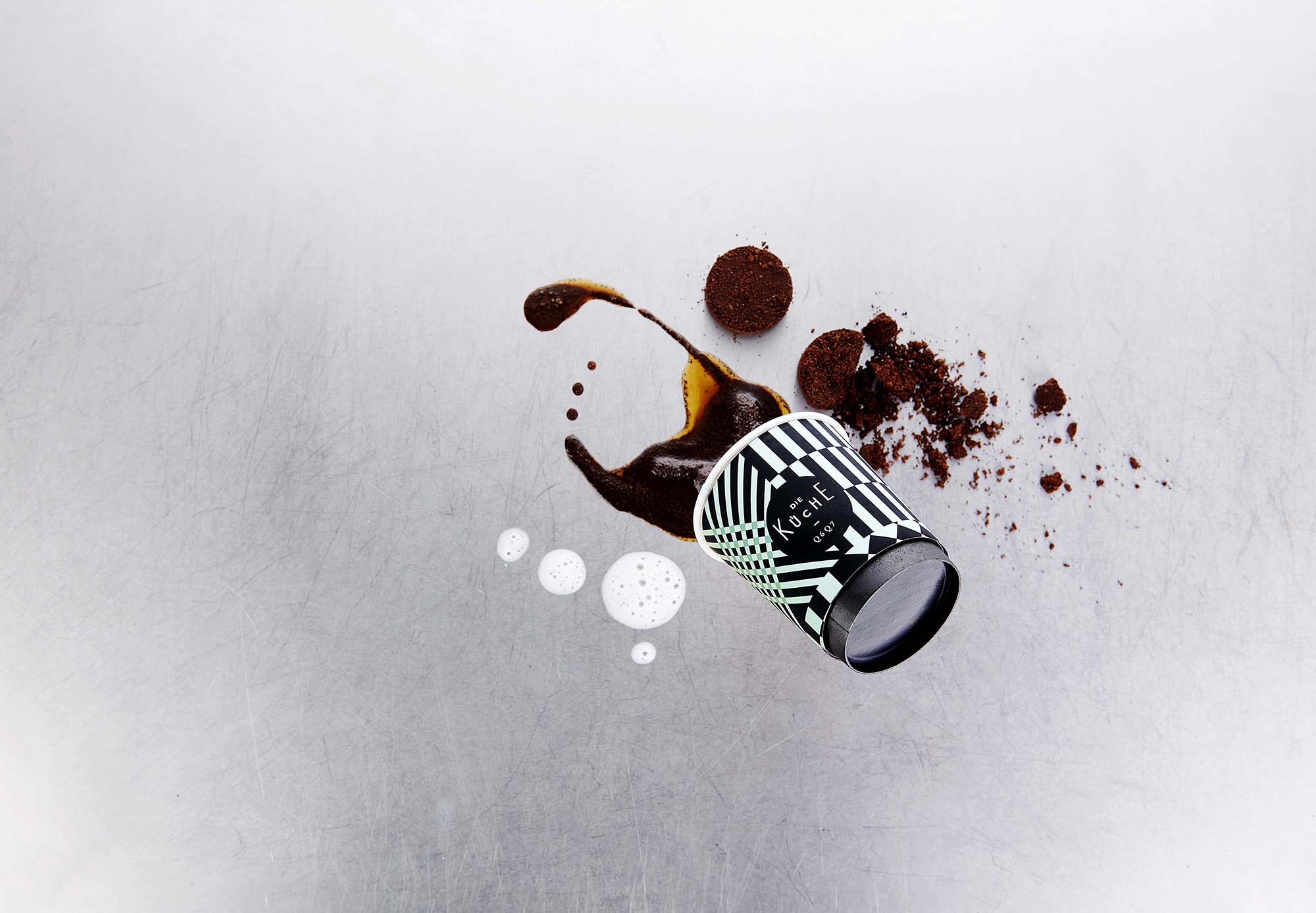
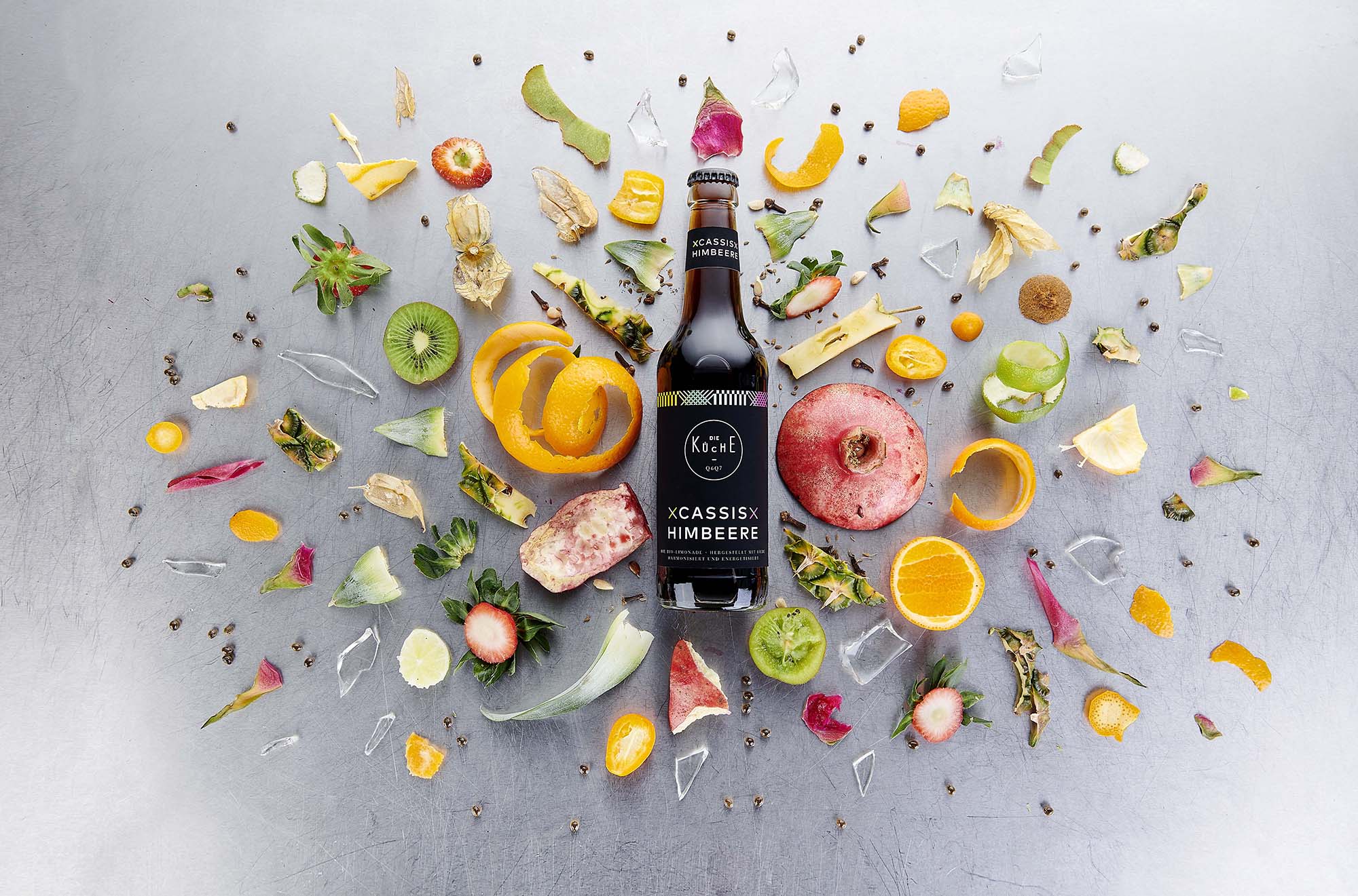
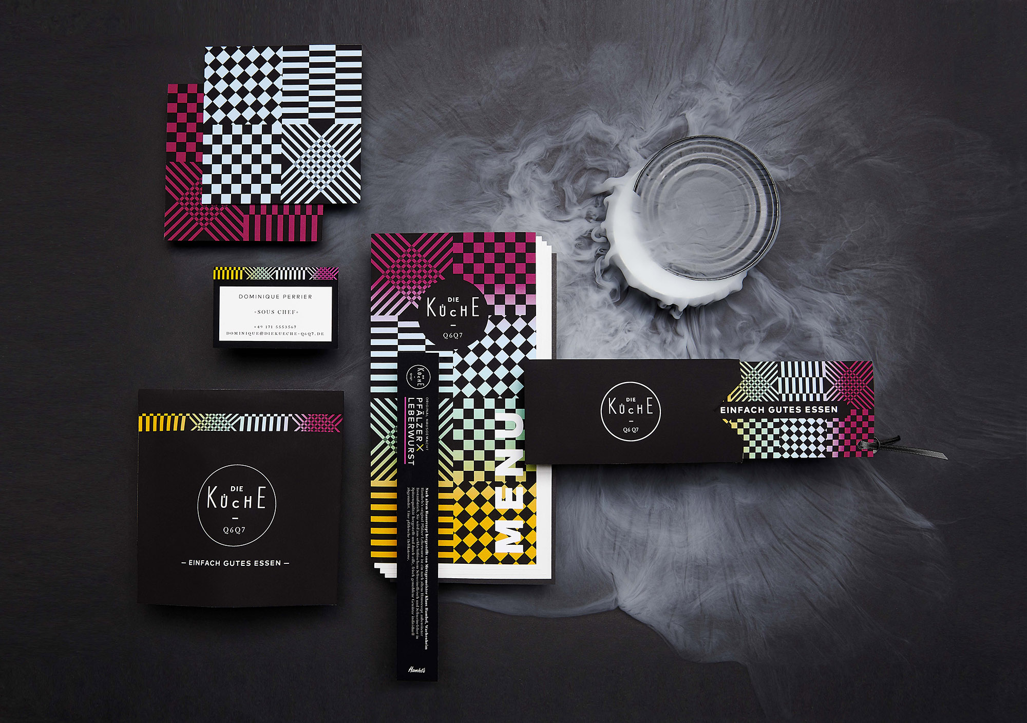
Die Küche
In the basement of the brand new Q 6 Q 7 quarter in Mannheim city centre: a creative remix of urban kitchen styles. Street food, local cuisine, world cuisine, Bistronomy, bread culture, wines, delicatessen and the best regional products: DIE KÜCHE offers a unique range of culinary delights. Urban Cooking meets traditional cuisine. Simply good food. Here you will find “simply good food” – for all those who are hungry for high-quality, creative and fresh food in an extraordinary ambience. The visual appearance works with different patterns derived from dish towels as the central element. The four basic colours represent the various culinary highlights. In addition to the classic corporate design tasks, we have also taken on other areas such as spatial design, editorial design, design of table top products and packaging.
.jpg)
%20bearbeitet.jpg)
.jpg)
.jpg)
.jpg)
.jpg)
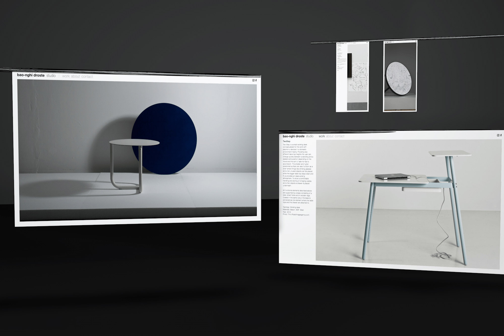
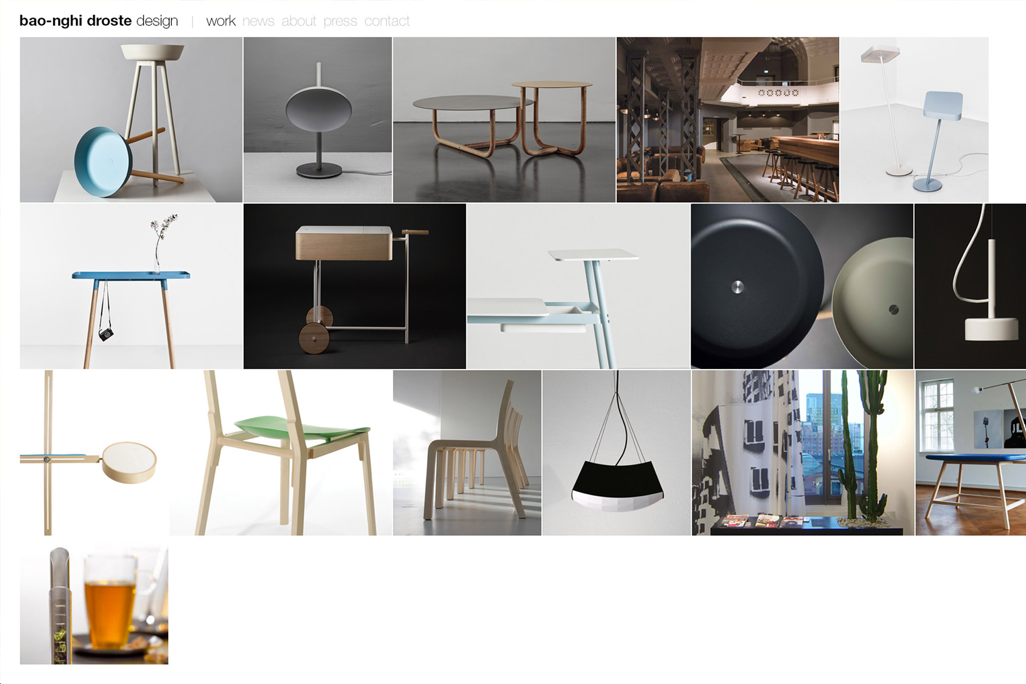
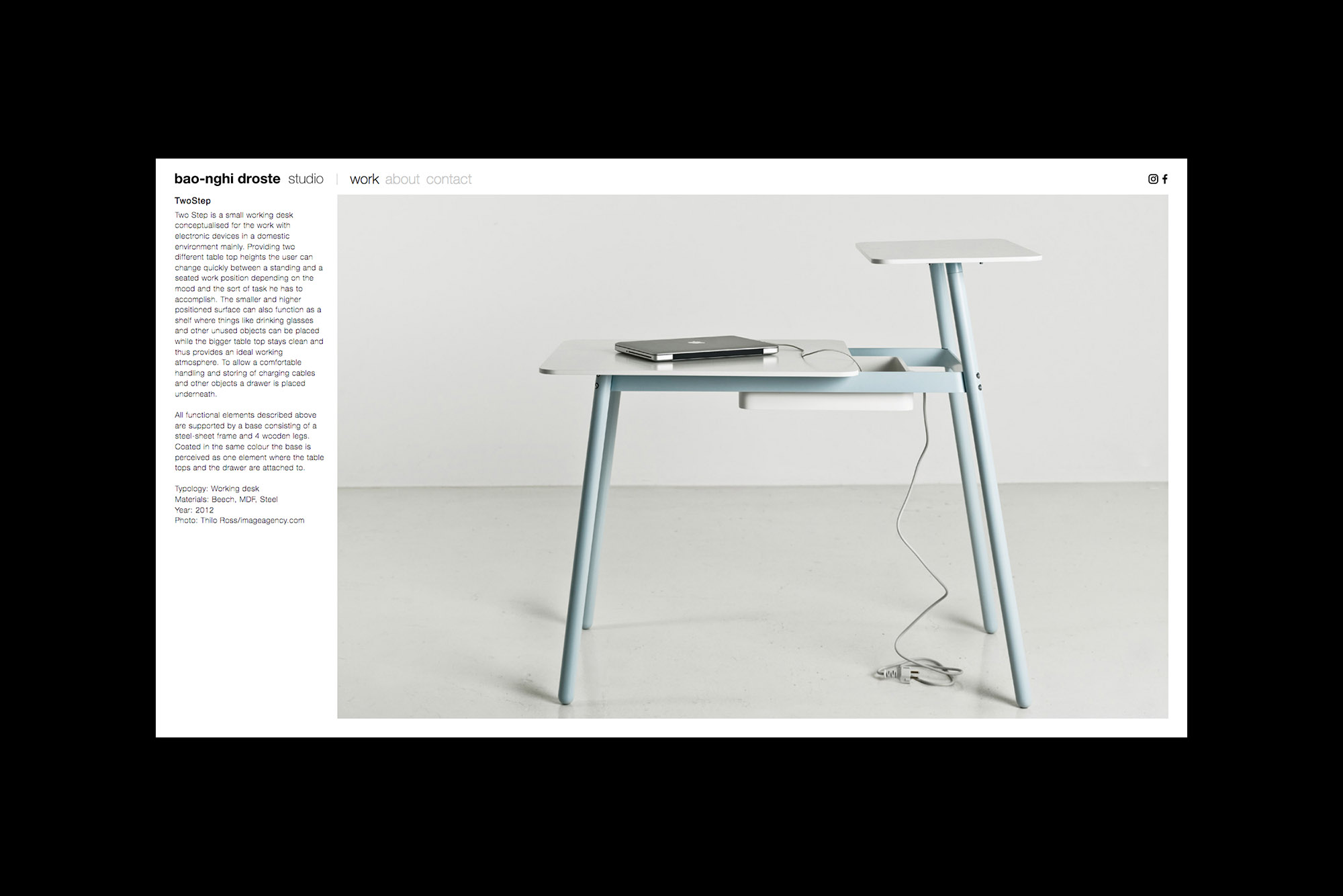
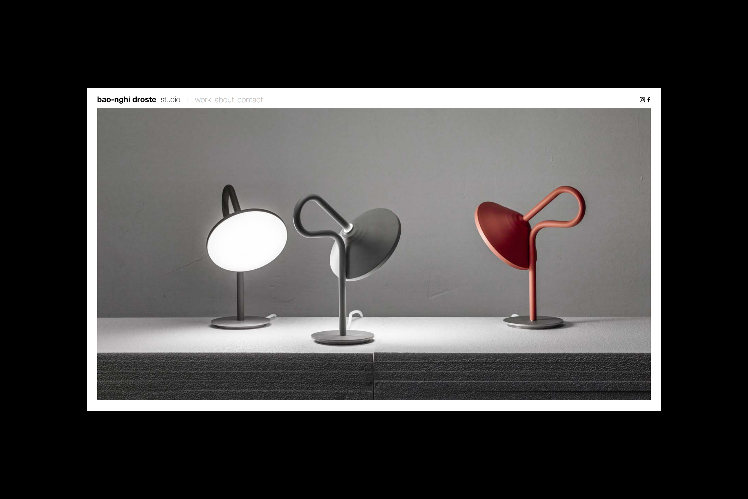
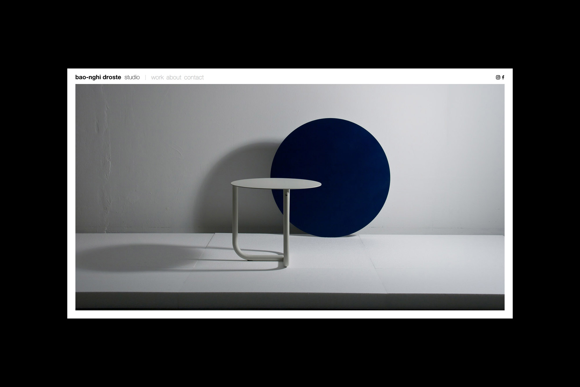
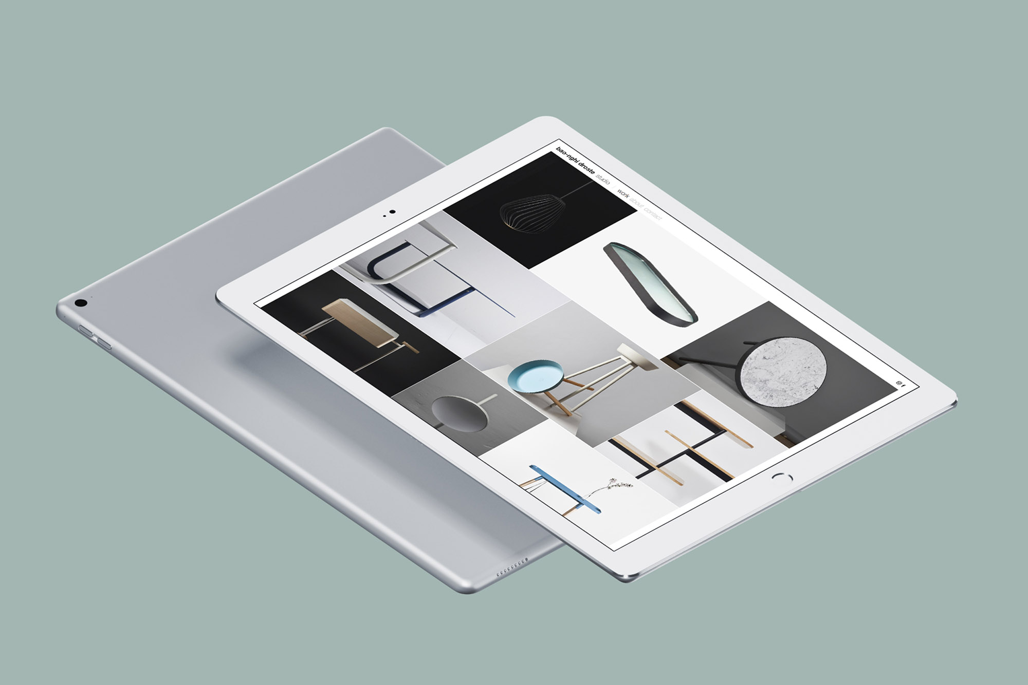
Bao-Nghi Droste
Bao-Nghi Droste is an industrial designer from Heidelberg. Before setting up his own studio he allready gathered work experience at the offices of Werner Aisslinger in Berlin and others. His iconic kitchen utensil “T-Serve” directly made it into production and gained the prestigious IF Product Design Award. From then on he has worked on a variety of projects in the field of interior-, product- and furniture design for different clients and has performed as a consultant in terms of furniture design for architectural practices.
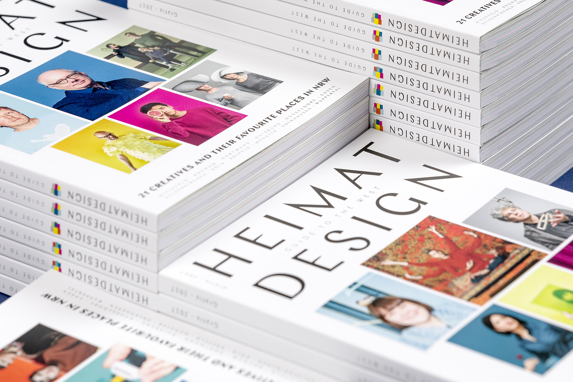
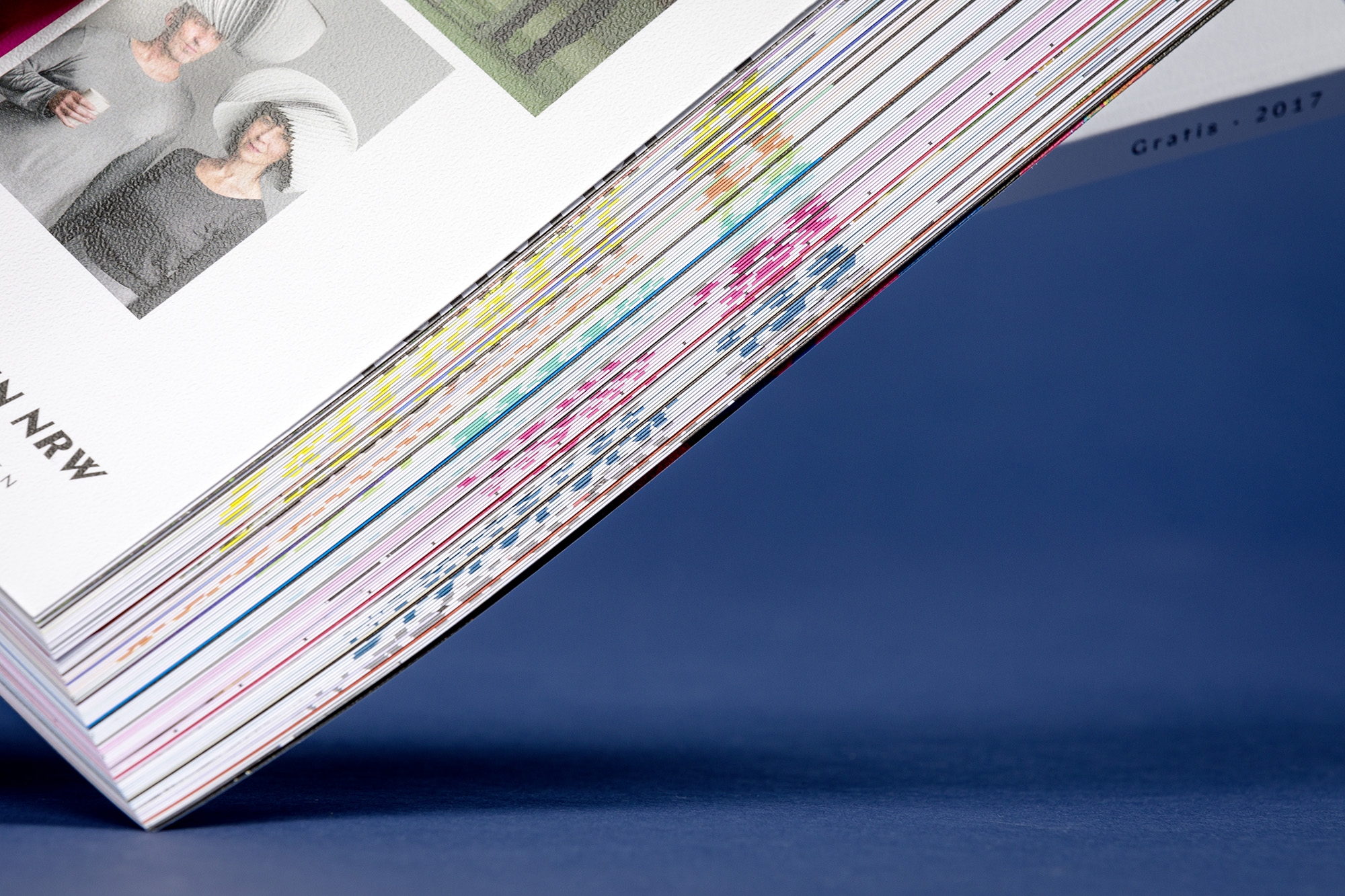
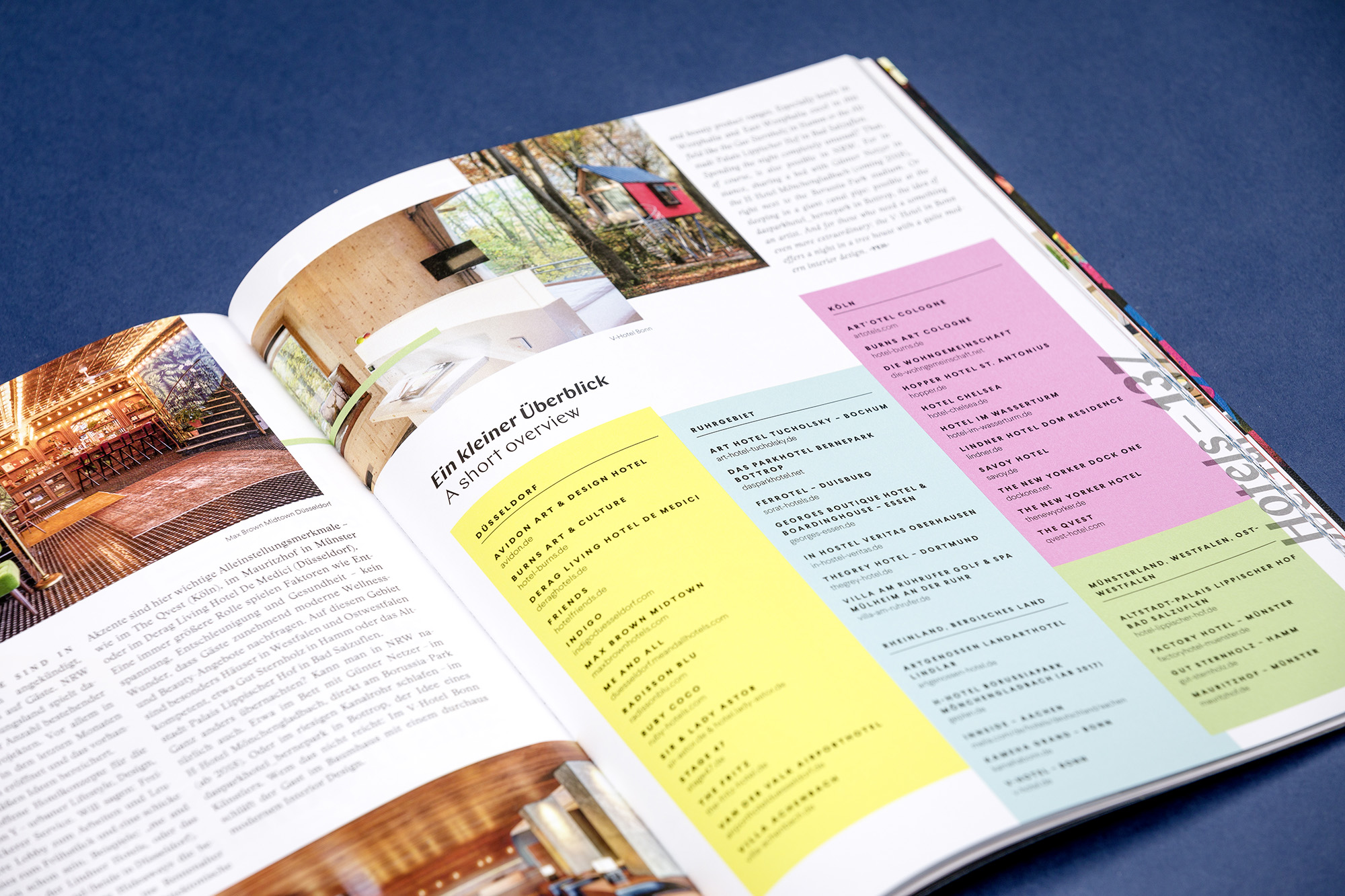
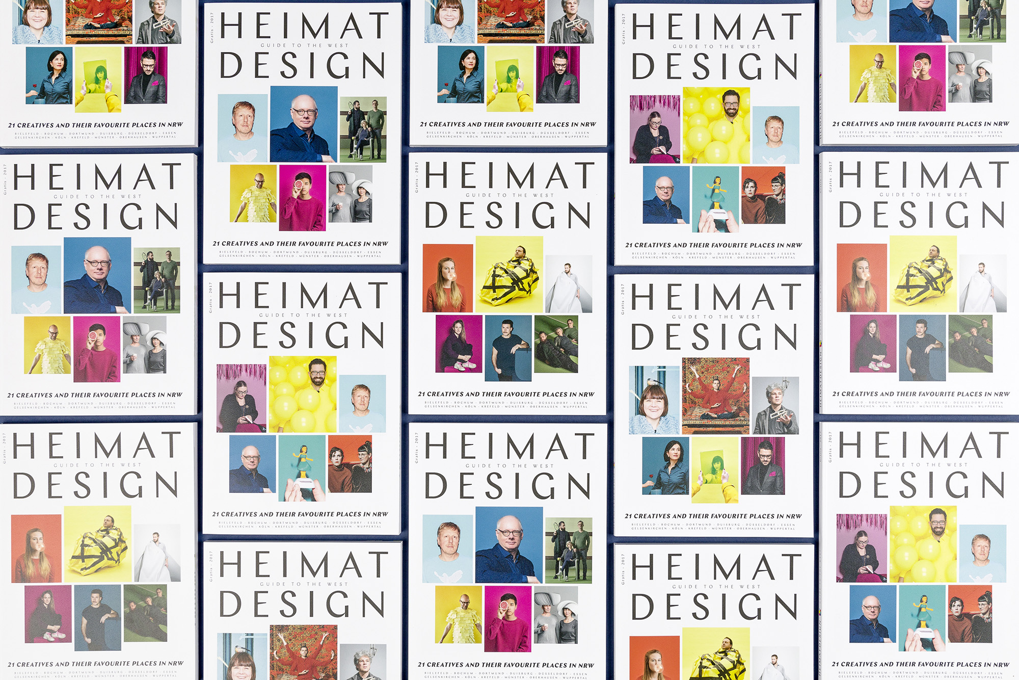
Heimatdesign
When was the last time you have been to North Rhine-Westphalia? (Local residents excluded, naturally) …precisely, why should you? The 16th issue of the Heimatdesign magazine wants to answer this question and offers a Guide to the West to make NRW perceptible on a touristic level, without being touristy while doing so. A collection of about 200 locations, confided to the magazine by 21 creative workers.